
Technical Project: Power BI & DAX
Disclaimer. Please access this case study from a computer. The formatting may be slightly off on mobile or tablet devices and could hinder your understanding of the content. As you scroll down, you’ll see sections with click-to-expand arrows that allow for a deeper dive into each section. After reading each section, please click the arrow again to reset the section. This project showcases my practical application and knowledge of Power BI from a business intelligence analyst perspective. While this project accurately represents my work, it is not a standard analysis or report. We sourced the dataset from Maven Analytics, though some data was modified for demonstration purposes. This includes cleaning or standardizing fields and adding or removing records to illustrate technical concepts. Credit for this project's comprehensive Power BI Workflow goes to Maven Analytics.
Click the play button below to listen to this technical project!
Interested in working together?
Project Overview

Business Consulting & CO.
Business Intelligence Analysts who help organizations leverage data for strategic decision-making.
Introduction
Our Business Consulting & Co. team is excited to announce our latest intern mentorship partnership with a local university. We will work directly with MBA-level interns to nurture skill development and provide a foundation for evaluating potential hires. We aim to ensure each student's professional growth and cultivate innovation within company teams.
Objective
We created a user-friendly resource that simplifies the various complexities of Power BI and ensures clarity for interns learning to navigate this critical area of expertise. Additional benefits include streamlining the onboarding experience, empowering MBA-level interns to understand the advanced details of Power BI, and ensuring they can apply this valuable skill set confidently in their day-to-day BI Analyst roles.
My Role
I see it as my job as a marketing data analyst to deliver a comprehensive and accessible learning experience every step of the way. To accomplish this task, I am taking a hands-on approach to overseeing this project, including curating content and visuals that seamlessly outline the intricacies of Power BI without making the material overly complicated. The dataset is from Pink Ribbon Rides, a large bike shop spanning multiple continents, for exploration and analysis in Power BI. The goal is to unveil powerful insights and trends to help interns grasp Power BI fundamentals more quickly.
Why Power BI?
Companies worldwide utilize Microsoft Power BI for its robust features and user-friendly interface, thus facilitating seamless data connectivity, transformation, and visualization. With Power BI, organizations can efficiently access and integrate data from diverse sources and empower users to generate valuable insights through advanced analytics and interactive reports. The platform's versatility allows businesses to adapt to evolving data needs, enabling the creation of customized dashboards and visualizations tailored to specific requirements.
Power BI vs. Excel
Excel and Power BI share the same analytics engines but couldn't be more different in terms of functionality and purpose. Power BI enhances the user experience and takes Excel's data transformation and modeling features to the next level by incorporating robust visualization and publishing tools. This integration allows any user to transition between the two programs seamlessly. Users can import all data models directly from Excel into Power BI. However, Power BI's emphasis on visualization allows users to create interactive reports and dashboards with greater ease and sophistication.
The Power BI Workflow

Power Query Editor
Data is loaded & transformed.

Model View
Data models are configured.

Data View
Table features & calculations are added.

Report View
Visuals & reports are designed.

Results:
Teams can track KPIs such as sales, revenue, profit, and returns. They can also compare regional performance, analyze product-level trends, and identify high-value customers.
Types of Data Connectors
Power BI offers extensive connectivity options, enabling users to access a wide range of data sources.
1. Connect to data source. 2. Check data type for each column. 3. Rename table & applied steps as needed. 4. Close & apply work.
-
Flat files and folders such as CSV, text, and XLSX formats.
Databases like SQL Server, Access, Oracle, and IBM Db2.
Power Platform components including datasets, datamarts, dataflows, and Dataverse.
Azure services such as Azure SQL Database, Azure Analysis Services, and Azure Databricks.
Online services like SharePoint, GitHub, Dynamics 365, Google Analytics, Salesforce, and Power BI Service.
Other sources including web feeds, R scripts, Apache Spark, and Hadoop clusters.
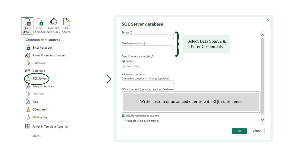
Connecting to a Database
Select database source and input authentication credentials to access the desired database.
Optionally, users can write custom or advanced queries using SQL statements to extract specific data subsets.
Select tables from the database and apply transformations as needed to prepare the data for analysis.
What is Power Query Editor?
Power Query Editor is a data preparation tool in Power BI that allows users to import, transform, and shape data before analysis. It offers a visual interface with intuitive menus for cleaning, filtering, merging, and advanced transformations.
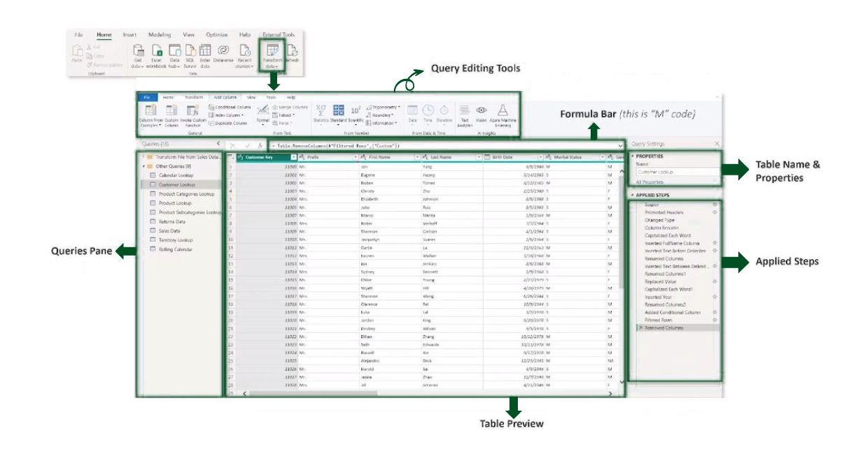
Query Editing Tools
The Home tab contains general settings and standard table transformation tools. The Transform tab offers tools for modifying existing columns. The Add Column tools facilitate the creation of new columns.
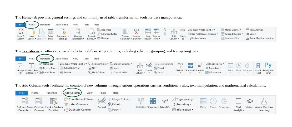
Basic Table Transformation
Sort values: Arranges data in ascending or descending order based on specified criteria (e.g., alphabetical, numerical).
Change data type: Adjusts the data format within a column to match its intended interpretation (e.g., converting a text field to a date or currency format).
Promote headers: Converts the first row of data into column headers, making it easier to identify and reference each column's contents.
Duplicate, move, or rename columns: Allows users to create copies of columns, rearrange their order within the dataset, or modify their names for clarity or consistency.
Keep or remove rows: Retains or eliminates specific rows of data based on defined conditions, such as duplicate entries or irrelevant information.
Choose or remove columns: Allows users to select desired columns for analysis or visualization while excluding unnecessary or redundant ones from the dataset.
Data Profiling Tools
View Data Quality & Fix Errors
Data profiling tools analyze data quality, composition, and distribution to streamline issue identification and resolution. Column quality reveals valid, error, or empty values.
Statistics & Data Distribution
Metrics like count, distinct count, unique values, min, and max offer quick, detailed insights primarily useful for numerical data. On the other hand, data distribution offers a visual representation of how data values are distributed across different ranges or categories. It provides histograms, frequency tables, or charts to illustrate the spread of data values quickly, thus helping users identify patterns, outliers, or anomalies.
Text Tools
Extract: Retrieve characters from text based on fixed lengths, first/last characters, ranges, or delimiters.
Format: Adjust a text column to upper, lower, or proper case, or append a prefix or suffix.
Split column: Divide a text column using a specific delimiter, number of characters, or other attributes.
Text Delimiter
This separates and distinguishes individual text elements within a larger string of text. In Power Query, you can specify the text delimiter to correctly instruct the software to divide the text data into separate columns. This allows you to split the text into distinct fields, making it easier to work with and analyze data within Power BI.
Numerical Tools
Statistics: Functions evaluate basic statistics for a selected column, including sum, min/max, average, count, count distinct, etc. These tools return a single value and are commonly used for exploring a table.
Standard, Scientific, & Trigonometry: Tools that can apply standard operations like addition, multiplication, division, and more advanced calculations to each value in a column. Unlike the Statistics tools, these operations are applied to each row in the table.
Information: Define binary flags (1/0 or True/False) to categorize rows as even, odd, positive, or negative.
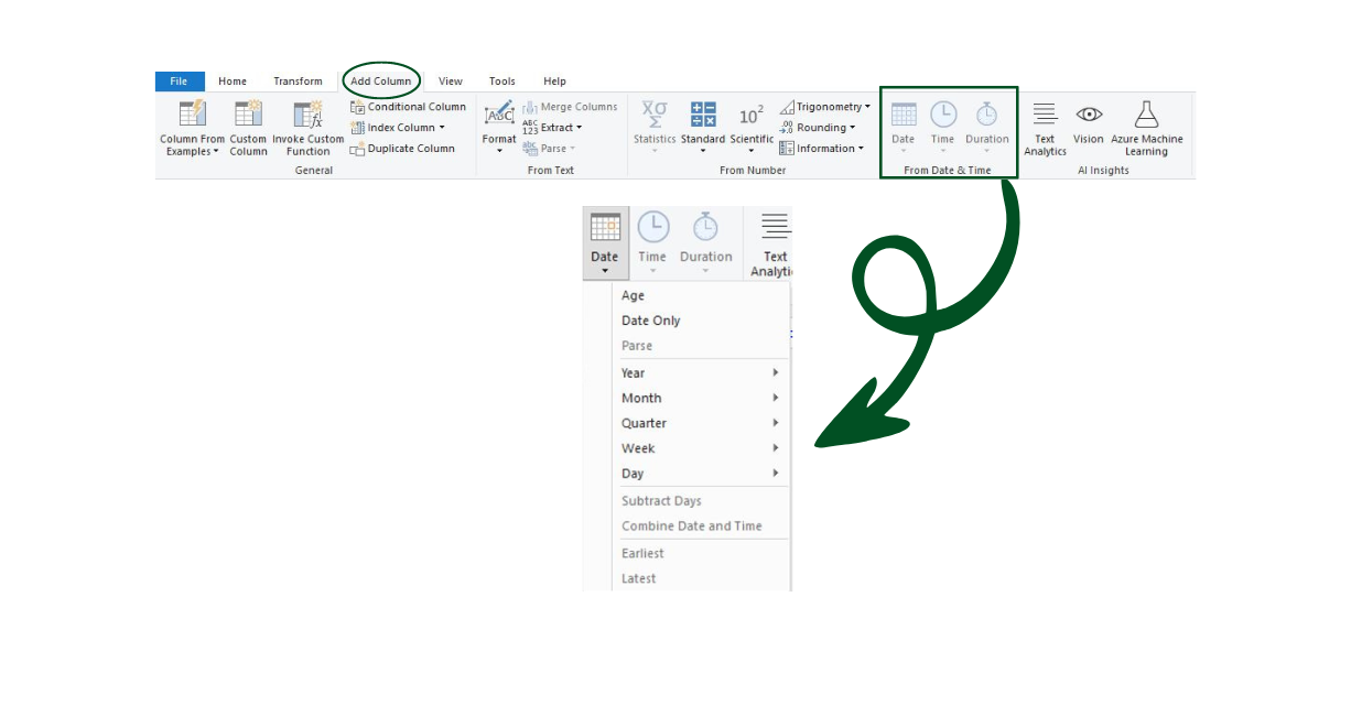
Date & Time Tools
Date and time tools include functions and features used to manipulate, analyze, and format date and time data within a dataset.
Age: Computes the difference between the current date and the date in each row to indicate the age of each record.
Date Only: Strips the time component from a date/time field, leaving only the date portion.
Year/Month/Quarter/Week/Day: Extracts individual components (such as year, month, quarter, week, or day) from a date field. Specific time-related options include hour, minute, second, etc.
Earliest/Latest: Identifies the earliest or latest date from a column, providing a single value.
Calendar Table: A static table containing predefined dates and associated attributes such as day of the week, month, quarter, and year. It typically covers a fixed range of dates, such as multiple years into the past and future.
A company might prefer a calendar table for historical analysis and reporting, as it provides a stable reference for comparing data over time.
Rolling Calendar: A dynamic approach where the date range shifts based on a specific reference date, such as the current date or the latest date in the dataset.
Offers flexibility, ensuring that the analysis remains focused on recent or relevant data without the need for manual adjustments. It can be particularly useful for scenarios requiring real-time or near-real-time insights, such as sales forecasting or inventory management.

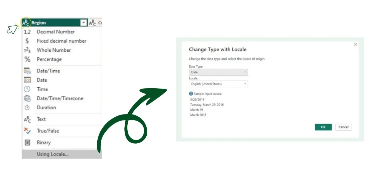
What is Locale?
When working with data that includes date or number formats specific to a particular region, changing the data type with locale ensures that the data is interpreted correctly according to the conventions of that locale. Essentially, this ensures consistency and accuracy in data interpretation, particularly when working with datasets from different regions or when sharing data across international teams. A locale refers to a set of parameters that defines the user's language, region, and cultural conventions. This can include date and time formats, currency symbols, and language for sorting and displaying data.
Index Column: This is a consecutive list of values assigned to each row in a dataset, typically starting from 0 or 1. It provides a unique identifier for each row to improve data organization and analysis. An Index Column is commonly used to establish row order, create unique identifiers, or facilitate record-level operations in data processing tasks.
Conditional Column: A new field created within a dataset based on specified logical rules or conditions. Using conditional logic (such as IF/THEN statements), users define criteria that determine the values to be assigned to the new column. Conditional columns are useful for categorizing data, flagging specific conditions, or deriving new information based on existing data attributes. They allow dynamic data manipulation and segmentation to enhance data analysis and visualization capabilities.
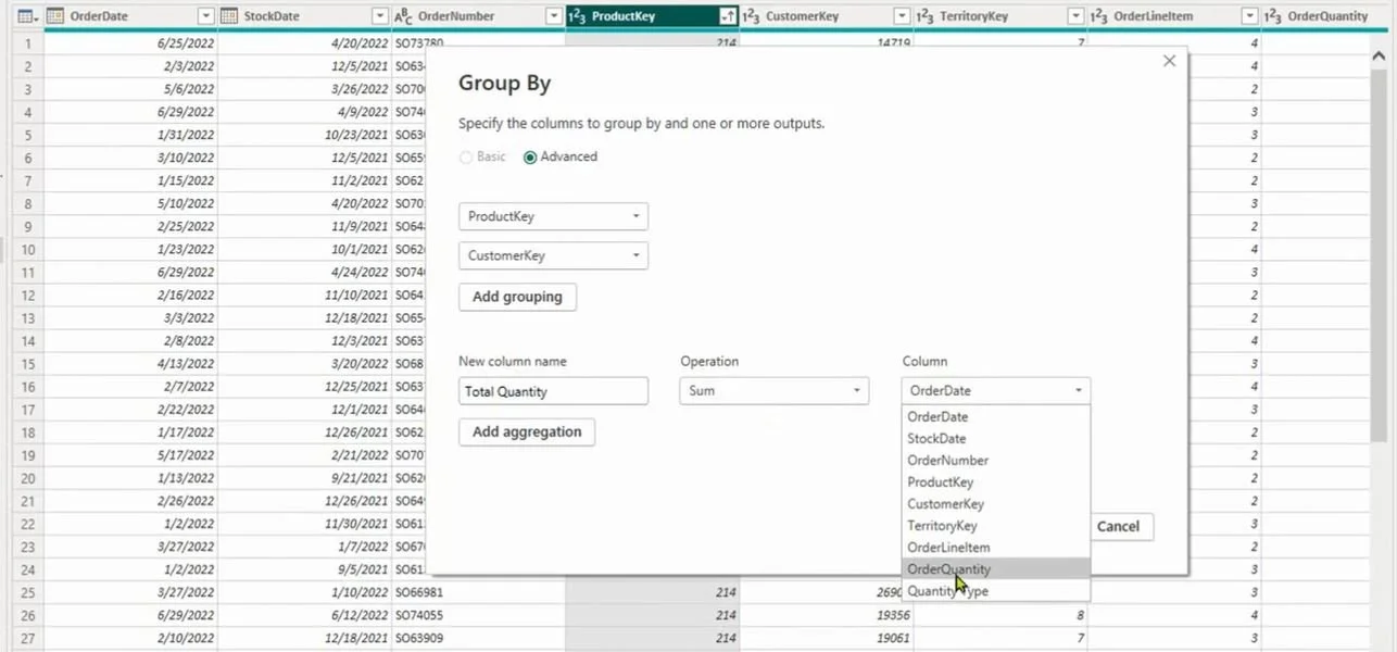
Group By Function: In data analysis, this function organizes data into groups based on one or more columns and allows users to specify which column(s) to use for grouping. The function then gathers rows with the same values in the specified column(s) into separate groups. This function is commonly employed in database queries and data transformation tasks to segment data for further analysis.
Grouping: This refers to the process of organizing data into subsets or groups based on shared characteristics or values in one or more columns. It involves using the Group By function to group rows of data with similar attributes. Grouping allows for the aggregation and analysis of data at a more granular level, facilitating insights into patterns or trends within specific groups.
Aggregation: Aggregation involves applying aggregate functions to data within each group created through the grouping process. Aggregate functions such as sum, count, average, min, or max are used to perform calculations or derive summary statistics on the values within each group. Aggregation condenses large volumes of data into meaningful summaries, enabling users to understand overall trends or patterns across groups of data.
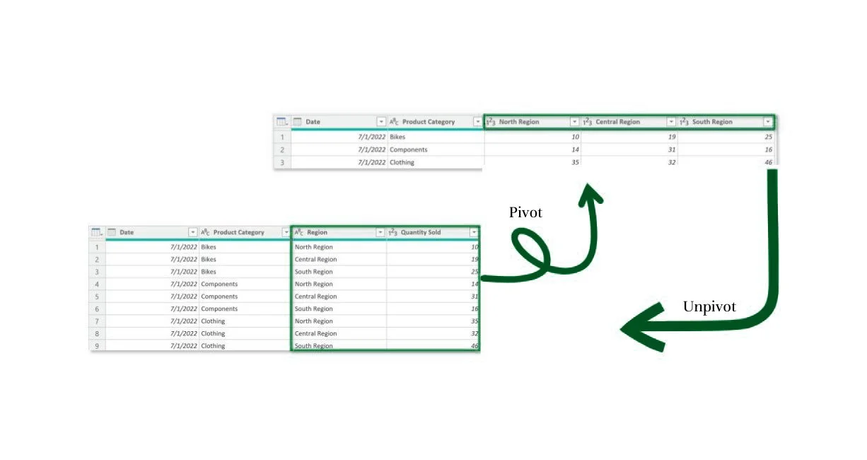
Pivoting: Pivoting in Power BI means transforming distinct row values into columns. In doing so, you reorganize data from a long to a wide format. This can be useful for summarizing or aggregating data across different categories or dimensions.
Unpivoting: This process converts distinct columns into rows, restructuring data from a wide to a long format. Unpivoting is often used to normalize data or to prepare it for further analysis.
Transpose: It works similarly to pivoting but doesn’t recognize unique values. Instead, it transforms the entire table so that each row becomes a column and vice versa.
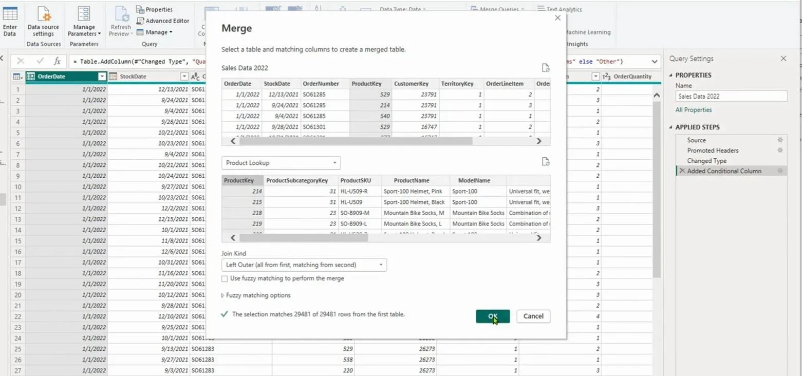
Merging Queries
In Power Query, this process allows you to consolidate related information into a single dataset for analysis or reporting purposes. However, it’s crucial to remember that while merging tables is possible, it’s not always advisable. Maintaining separate tables and defining relationships within the data model is preferred in many scenarios.
Appending Queries
This process allows for consolidating or stacking tables with identical column structures and data types. For example, we can append the Pink Ribbon Rides Sales 2020 table to the Pink Ribbon Rides Sales 2021 table, as they share the same table structures. It’s essential to note that appending adds rows to an existing table or query.
Appending Files from a Folder
Appending files from a folder involves combining data from multiple files stored within the same directory or folder. This process allows you to consolidate data from various files into a single dataset, which can help analyze or report on information spread across multiple files. As new files are added, simply refreshing the query will automatically append them.
Data Modeling
A data model is a structured representation of data consisting of interconnected tables linked through relationships established using common fields, such as a Product Key. In this model, tables are connected via relationships, facilitating the retrieval and analysis of data across tables. Primary keys serve as unique identifiers for each row within a table, ensuring data integrity by uniquely identifying each record. These primary keys relate to foreign keys in fact tables, which contain multiple instances of each value and establish connections with primary keys in dimension tables. This relational structure forms the foundation of a data model and results in efficient data organization and analysis.
Filter Context & Flow
Filter context and flow refer to how filters applied to one table affect related tables within a data model. In a visual representation of the model, arrows indicate the direction of filter flow, typically from the one (1) side of the relationship to the many (*) side. When a table is filtered, this filter context is passed downstream to any related tables, adhering to the direction of the arrow. It's crucial to note that filter context cannot flow upstream, meaning filters applied to downstream tables do not impact upstream tables. To visualize this concept effectively, arranging lookup tables above fact tables in the model serves as a helpful reminder that filters always flow downstream to enhance the model's clarity and usability.
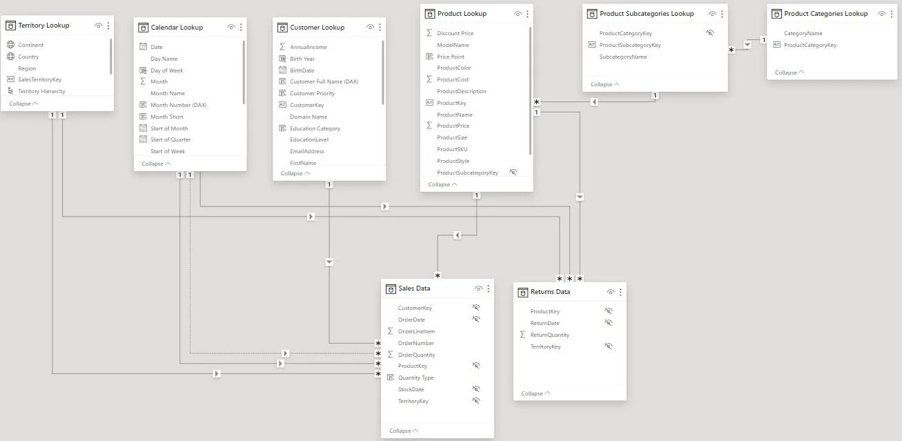
Active & Inactive Relationships
These refer to the state of connectivity between tables. An active relationship indicates that the relationship is actively used in queries and calculations within the model, allowing for data retrieval and analysis based on the defined connections. In contrast, an inactive relationship is temporarily disabled and not utilized in queries or calculations. It can be useful for scenarios where multiple relationships exist between the same tables or for testing different relationship configurations without permanently altering the model.
Relationship Cardinality
Relationship cardinality defines the nature of the connections between tables in terms of the uniqueness of values in a column. Ideally, all relationships in the data model should adhere to a one-to-many cardinality, where each instance of the primary key in one table corresponds to many instances of the foreign key in another table. This one-to-many relationship ensures data integrity and consistency, allowing for efficient data retrieval and analysis across related tables.
Data Formats & Categories in Model View
With this view, users customize data formats and categories to enhance data presentation and functionality. This involves specifying the format of data fields, like text or date, through the Column Tools menu in the Data view or the Properties pane in the Model view. Additionally, users can assign data categories, such as geospatial or URL, to fields, aiding features like location-based mapping. This capability streamlines data interpretation and improves the effectiveness of features like geospatial mapping or URL recognition. This enhances the overall data visualization and analysis process within Power BI.
Model Layouts
These layouts generate customized views to showcase specific segments of extensive and intricate data models. For instance, one can create a Sales View focusing solely on tables associated with sales data and a Returns View highlighting tables relevant to returns. It’s important to note that this process doesn’t involve duplicating tables. Instead, it provides tailored perspectives on the existing data model, enabling users to streamline their analysis and focus on specific areas of interest.
Hierarchies
Hierarchies represent collections of columns representing various levels of detail. For instance, a Geography hierarchy could consist of country, State, and city fields. In both tables and reports, hierarchies are perceived as single entities and help users navigate through different levels using "drill up" and "drill down" functionalities. This enables users to explore data from broader perspectives down to more specific details.
Hiding Fields
In data modeling, hiding fields allows users to conceal specific fields from the Report view, making them inaccessible for direct inclusion in reports while remaining available in Data and Model views. This feature can be managed by right-clicking a field in the Data or Model view or selecting the “Is hidden” option in the Properties pane. Hiding fields is often employed to prevent users from filtering or using invalid fields. It also helps reduce reports' clutter or hide irrelevant metrics from view. A helpful tip is to hide foreign keys in fact tables, encouraging users to filter data using primary keys in dimension tables instead. This enhances data integrity and facilitates proper data analysis.
Checking Connectivity
Using Report view, checking connectivity during the data modeling process is essential for validating relationships, testing data accuracy, exploring data insights, gathering feedback, and iteratively improving the data model to ensure it effectively supports analysis and decision-making.
Report view in Power BI allows users to design visual reports by adding and arranging visualizations like charts and tables to present insights derived from their data analysis. The view offers formatting options, customization tools, and interactive features to enhance report design. Users can apply filters and slicers for dynamic data exploration. Once designed, reports can be published and shared for viewing and analysis within Power BI.
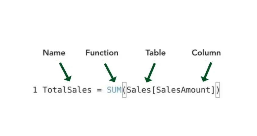
What is DAX?
Data Analysis Expressions (DAX) is a formula language used in Power BI, Excel Power Pivot, and SQL Server Analysis Services (SSAS) Tabular models. DAX is designed for data modeling and business intelligence tasks, allowing users to create calculated columns, measures, and calculated tables. It also enables the manipulation and analysis of data by providing functions and operators to perform calculations, aggregations, filtering, and more. DAX formulas are written in a syntax similar to Excel formulas and are used to extract insights and perform complex calculations on large datasets.
What is M Code?
M Code offers diverse functions and operators for efficient data manipulation, empowering users to tailor data to their needs. Crucial for data preparation, it transforms raw data into a structured format conducive to analysis. Primarily utilized in the Power Query Editor, M Code is dedicated to extracting, transforming, and loading data to facilitate seamless data management processes.
DAX vs. M Code
DAX creates calculations and business logic within the Power BI data model for analysis and visualization. M Code prepares and transforms data in the Power Query Editor.
DAX Measures
Measures in Power BI compute values based on the filters applied in the report, thus adapting to the filter context. They don't augment table data or affect file size. Measures dynamically recalculate whenever filters in the report are adjusted. They are primarily employed for aggregating values within report visuals, aiding in data analysis and visualization.
DAX Calculated Columns
Calculated columns in Power BI compute values for each row in a table based on the data within that row, functioning within the context of the row. These static values become part of the table’s structure, impacting file size. They recalculate when data sources refresh or when related columns change. Generally, calculated columns filter data in reports, providing additional insights and facilitating analysis.
Implicit Measures vs. Explicit Measures
Power BI automatically creates implicit measures when dragging a field onto a visualization. They represent basic aggregations like sum or count. On the other hand, explicit measures are user-defined calculations using DAX formulas. While implicit measures are quick to create and suitable for basic analysis, explicit measures provide greater control and customization for advanced analytics and business logic.
Quick Measures:
Calculations vs. Suggestions
Quick Measures in Power BI are predefined calculations that allow users to quickly create common analytical calculations without manually writing DAX formulas. They serve as valuable learning aids for beginners or for crafting intricate formulas. However, caution is advised, as mastering DAX requires a profound understanding of its underlying principles and theory. There are two types of Quick Measures: Quick Measure Calculations and Quick Measure Suggestions.
Quick Measure Calculations: Power BI provides pre-defined DAX calculations to cover common analytical scenarios such as year-to-date totals, moving averages, and cumulative totals. Users can apply these calculations directly to their data by selecting the desired measure from the Quick Measures dialog.
Quick Measure Suggestions: These are intelligent recommendations generated by Power BI based on the data model and fields used in the report. These suggestions analyze the data and propose relevant calculations that users may find useful for their analysis. Users can review and accept these suggestions to create new measures quickly and easily, tailored to their specific analytical needs.
Dedicated Measure Tables
This is a table created specifically to store measures in a Power BI model. It's a common best practice to maintain organization and facilitate easy access to measures. By dedicating a separate table for measures, users can locate them, stay organized, and group related measures into folders, enhancing overall manageability and usability of the Power BI model.
DAX Syntax
A functional language like DAX requires all code samples, including formulas, to contain a function. These formulas can consist of conditional statements, functions, and references. Additionally, DAX formulas are categorized into two types: numeric and non-numeric. Numeric formulas handle values like integers, decimals, and currencies, while non-numeric formulas deal with strings and binary objects.
Operators
Programming symbols or functions that perform operations on one or more operands to produce a result. These operations can include arithmetic calculations, comparisons, logical operations, and more. Operators are fundamental to writing expressions and statements in programming languages, allowing developers to manipulate data and control the flow of a program.
-
+ Addition
- Subtraction
* Multiplication
/ Division
^ Exponent
-
= Equal to
> Greater than
< Less than
>= Greater than or equal to
<= Less than or equal to
<> Not equal to
-
& Concatenates two values to produce one text string
&& Create an AND condition between two logical expressions
|| (double pipe) Create an OR condition between two logical expressions
IN Creates a logical OR condition based on a given list (using curly brackets)
Functions
Predefined formulas that perform specific operations on data to return a result. These functions can be used to manipulate data, perform calculations, apply conditions, filter data, and more within Power BI reports and data models. DAX functions are categorized into different types based on their purpose, such as aggregation functions (e.g., SUM, AVERAGE), date and time functions (e.g., DATE, YEAR), logical functions (e.g., IF, AND, OR), text functions (e.g., CONCATENATE, LEFT), and many others. These functions are crucial in transforming raw data into meaningful insights and visualizations in Power BI.
-
CONCATENATE
COMBINEVALUES
FORMAT
LEFT/MID/RIGHT
UPPER/LOWER
LEN
SEARCH/FIND
REPLACE
SUBSTITUTE
TRIM
-
CALCULATE
FILTER
ALL
ALLEXCEPT
ALLSELECTED
KEEPFILTERS
REMOVEFILTERS
SELECTEDVALUE
-
IF
IFERROR
AND
OR
NOT
SWITCH
TRUE
FALSE
-
SUM
AVERAGE
MAX/MIN
DIVIDE
COUNT/COUNTA
COUNTROWS
DISTINCTCOUNT
-
SUMX
AVERAGEX
MAXX/MINX
RANKX
COUNTX
-
SUMMARIZE
ADDCOLUMNS
GENERATESERIES
DISTINCT
VALUES
UNION
INTERSECT
TOPN
-
DATE
DATEDIFF
YEARFRAC
YEAR/MONTH
DAY/HOUR
TODAY/NOW
WEEKDAY
WEEKNUM
NETWORKDAYS
-
DATESYTD
DATESMTD
DATEADD
DATESBETWEEN
-
RELATED
RELATEDTABLE
CROSSFILTER
USERELATIONSHIP
DAX Examples:
-
Bike Return Rate =
CALCULATE(
[Return Rate],
'Product Categories Lookup'[CategoryName] = "Bikes"
)
-
Bike Returns =
CALCULATE(
[Total Returns],
'Product Categories Lookup'[CategoryName] = "Bikes"
)
-
Bikes Sales =
CALCULATE(
[Quantity Sold],
'Product Categories Lookup'[CategoryName] = "Bikes"
)
-
Bulk Orders =
CALCULATE(
[Total Orders],
'Sales Data'[OrderQuantity] >1
)
-
High Ticket Orders =
CALCULATE(
[Total Orders],
FILTER(
'Product Lookup',
'Product Lookup'[ProductPrice] > [Overall Average Price]
)
)
-
Order Target =
[Previous Month Orders] * 1.1
-
Profit Target =
[Previous Month Profit] * 1.1
-
Revenue Target =
[Previous Month Revenue] * 1.1
-
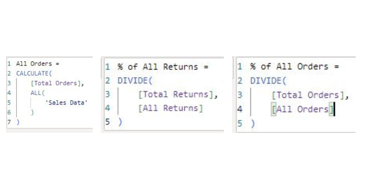
% of All Orders =
DIVIDE(
[Total Orders],
[All Orders]
)
-
% of All Returns =
DIVIDE(
[Total Returns],
[All Returns]
)
-
Previous Month Orders =
CALCULATE(
[Total Orders],
DATEADD(
'Calendar Lookup'[Date],
-1,
MONTH
)
)
-
Previous Month Profit =
CALCULATE(
[Total Profit],
DATEADD(
'Calendar Lookup'[Date],
-1,
MONTH
)
)
-
Previous Month Return =
CALCULATE(
[Total Returns],
DATEADD(
'Calendar Lookup'[Date],
-1,
MONTH
)
)
-
Previous Month Revenue =
CALCULATE(
[Total Revenue],
DATEADD(
'Calendar Lookup'[Date],
-1,
MONTH
)
)
-
Quantity Returned =
SUM(
'Returns Data'[ReturnQuantity]
)
-
Quantity Sold =
SUM(
'Sales Data'[OrderQuantity]
)
-
Return Rate =
DIVIDE(
[Quantity Returned],
[Quantity Sold],
"No Sales"
)
-
Weekend Orders =
CALCULATE(
[Total Orders],
'Calendar Lookup'[Weekend] = "Weekend"
)
-
10-day Rolling Revenue =
CALCULATE(
[Total Revenue],
DATESINPERIOD(
'Calendar Lookup'[Date],
max(
'Calendar Lookup'[Date]
),
-10,
DAY
)
)
-
90-day Rolling Profit =
CALCULATE(
[Total Profit],
DATESINPERIOD(
'Calendar Lookup'[Date],
LASTDATE(
'Calendar Lookup'[Date]
),
-90,
DAY
)
)
-
Total Cost =
SUMX(
'Sales Data',
'Sales Data'[OrderQuantity]
*
RELATED(
'Product Lookup'[ProductCost]
)
)
-
Total Customers =
DISTINCTCOUNT(
'Sales Data'[CustomerKey]
)
-
Total Orders =
DISTINCTCOUNT(
'Sales Data'[OrderNumber]
)
-
Total Profit =
[Total Revenue] - [Total Cost]
-
Total Returns =
COUNT(
'Returns Data'[ReturnQuantity]
)
-
Total Revenue =
SUMX(
'Sales Data',
'Sales Data'[OrderQuantity] *
RELATED(
'Product Lookup'[ProductPrice]
)
)
-
Overall Average Price =
CALCULATE(
[Average Retail Price],
ALL(
'Product Lookup'
)
)
-
YTD Revenue =
CALCULATE(
[Total Revenue],
DATESYTD(
'Calendar Lookup'[Date]
)
)
-
Price Adjustment (%) = GENERATESERIES(-1, 1, 0.1)
-
Total Revenue (Customer Detail) =
IF(
HASONEVALUE(
'Customer Lookup'[CustomerKey]
),
[Total Revenue],
"_"
)
-
Total Orders (Customer Detail) =
IF(
HASONEVALUE(
'Customer Lookup'[CustomerKey]
),
[Total Orders],
"_"
)
-
Full Name (Customer Detail) =
IF(
HASONEVALUE(
'Customer Lookup'[CustomerKey]
),
MAX(
'Customer Lookup'[Full Name]
),
"Multiple Customers"
)
-
Revenue Target Gap = [Total Revenue] - [Revenue Target]Item description
-
Profit Target Gap = [Total Profit] - [Profit Target]
-
Order Target Gap = [Total Orders] - [Order Target]
-
Adjusted Price = [Average Retail Price] * (1 + 'Price Adjustment (%)'[Price Adjustment (%) Value])
-
Adjusted Profit =
[Adjusted Revenue] - [Total Cost]
-
Adjusted Revenue =
SUMX(
'Sales Data',
'Sales Data'[OrderQuantity]
*
[Adjusted Price])
Basic Math & Stats Functions
SUM: Evaluates the sum of a column.
AVERAGE: Returns the average (arithmetic mean) of all the numbers in a column.
MAX: Returns the largest value in a column or between two scalar expressions.
MIN: Returns the smallest value in a column or between two scalar expressions.
DIVIDE: Performs division and returns the alternate result (or blank) if DIV/0.
Counting Functions
COUNT: Counts the number of non-empty cells in a column (excluding Boolean values).
COUNTA: Counts the number of non-empty cells in a column (including Boolean values).
DISTINCTCOUNT: Counts the number of distinct values in a column.
COUNTROWS: Counts the number of rows in the specified table or a table defined by an expression.
Basic Conditional & Logical Functions
IF: Checks if a given condition is met and returns one value if the condition is TRUE and another if the condition is FALSE.
IFERROR: Evaluates an expression and returns a specified value if it returns an error, otherwise returns the expression itself.
SWITCH: Evaluates an expression against a list of values and returns one of multiple possible expressions.
AND: Checks whether both arguments are TRUE to return TRUE; otherwise, returns FALSE. Note: Use the && and || operators to include more than two conditions.
OR: Checks whether any argument is TRUE to return TRUE; otherwise, returns FALSE. Note: Use the && and || operators to include more than two conditions.
Text Functions
LEN: Returns the number of characters in a string.
CONCATENATE: Joins two text strings into one. Note: Use the & operator as a shortcut, or to combine more than two strings.
UPPER/LOWER: Converts a string to upper or lower case.
LEFT/RIGHT/MID: Returns a number of characters from the start/middle/end of a text string.
SUBSTITUTE: Replaces an instance of existing text with new text in a string.
SEARCH: Returns the position where a specified string or character is found, reading left to right.
Basic Date & Time Functions
TODAY/NOW: Returns the current date or exact time.
DAY/MONTH/YEAR: Returns the day of the month (1-31), month of the year (1-12), or year of a given date.
HOUR/MINUTE/SECOND: Returns the hour (0-23), minute (0-59), or second (0-59) of a given datetime value.
WEEKDAY/WEEKNUM: Returns a weekday number from 1 (Sunday) to 7 (Saturday), or the week # of the year.
EOMONTH: Returns the date of the last day of the month, +/- a specified number of months.
DATEDIFF: Returns the difference between two dates, based on a given interval (day, hour, year, etc.).
Joining Data
with Relationship Functions
RELATED: Retrieves a related value from a table that is on the "one" side of a one-to-many relationship based on the current row's context.
RELATEDTABLE: Returns a table of related records from the "many" side of a one-to-many relationship based on the current row's context.
CROSSFILTER: Specifies the direction of filtering between two tables in a relationship, allowing you to control how filters propagate across tables.
USERELATIONSHIP: Enables you to override the automatic relationship detection in Power BI and specify a different relationship to use for filtering purposes.
Calculate Function
Power BI's CALCULATE function evaluates an expression within a modified filter context so you can apply additional filters or dynamically alter the filter context for a calculation. CALCULATE is often used to modify the context in which a calculation is performed, such as applying specific filters to columns or tables or ignoring certain filters altogether. This function is crucial for creating complex calculations and implementing advanced filtering logic in Power BI reports and dashboards.
ALL Function
Power BI’s ALL function removes all filters from a column or table within the current filter context and returns all the rows from the specified column or table while disregarding any filters that might have been applied to it. The ALL function is commonly used to retrieve unfiltered data for calculations or comparisons. It can be applied to single columns or entire tables and is often combined with other functions like CALCULATE to create complex measures and analyses in Power BI reports.
Filter Functions
CALCULATE: Evaluates an expression in a modified filter context, allowing you to apply additional filters or alter the filter context dynamically.
FILTER: Applies a filter to a table or an expression, returning the subset of data that meets the specified conditions.
ALL: Removes filters from a table, column, or context, returning all the values without any applied filters.
ALLEXCEPT: Removes all filters from a table except those specified, retaining the filter context for selected columns.
ALLSELECTED: Retains filters that have been applied to other columns or tables while removing filters from the specified column or table.
KEEPFILTERS: Applies filters to the context only if they are not already present, preserving existing filters in the context.
REMOVEFILTERS: Removes filters from all columns in the filter context, returning the table with no filters applied.
SELECTEDVALUE: Returns the value of a column if there is only one value present in the current filter context; otherwise, it returns a default value.
Iterator (X) Functions
SUMX: Calculates the sum of an expression for each row in a table or a table-like array and returns the total sum.
AVERAGEX: Calculates the average of an expression for each row in a table or a table-like array and returns the average value.
MAXX/MINX: Calculates the maximum or minimum value of an expression for each row in a table or a table-like array and returns the maximum or minimum value, respectively.
RANKX: Assigns a rank to each row in a table based on the value of an expression and returns the rank as a numeric value.
COUNTX: Counts the number of rows in a table or a table-like array that satisfy a condition specified by an expression and returns the count.
Time Intelligence Functions
DATESYTD: Returns a table that contains all the dates from the start of the year up to and including the given date, based on the current context.
DATESMTD: Returns a table that contains all the dates from the start of the month up to and including the given date, based on the current context.
DATEADD: Returns a new date that is a specified number of units (days, months, years) away from the original date.
DATESBETWEEN: Returns a table that contains dates between two specified dates, inclusive, based on the current context.
Function: HASONEVALUE
Checks for whether a column or table contains exactly one unique value and returns a TRUE or FALSE value depending on the number of unique values in the specified column or table. HASONEVALUE can be helpful when verifying if a certain filter or context results in a single distinct value in a column. This function is often combined with other functions to control the behavior of measures and expressions.
Measuring Target Gap with DAX
Refers to the difference between an actual value and a target value. This gap is often used in business reporting and analytics to measure performance against goals or expectations. By calculating the Target Gap, you can assess how far actual performance is from the desired outcome.
Dashboard Methodology
A properly crafted dashboard should cater to specific user needs, employing transparent metrics and visuals while ensuring an effortless user experience.
Design Framework
Define the user and objective.
Select appropriate metrics.
Effectively showcase the data.
Remove unnecessary elements.
Use layout to draw attention.
Convey a clear narrative.
Color Theory Considerations
Consistent Palette: Stick to a consistent, on-brand color scheme throughout the dashboard.
Contrast and Readability: Ensure text and data have enough contrast for easy reading.
Color Meaning: Use colors to convey specific meanings, like red for negatives and green for positives.
Consider Color Blindness: Design with color-blind users in mind, using accessible color combinations when applicable.
Limit Colors: Keep the number of colors minimal to avoid confusion.
Use Grayscale for Neutrals: Reserve grayscale for neutral elements like borders.
User Experience

Analyst
Provides analysts with detailed insights and allows for in-depth analysis at a granular level. They prefer visualizations such as tables or combination charts that offer comprehensive data representation. These dashboards should contain granular details that support root-cause analysis and enable analysts to drill down into specific data points to uncover patterns and trends. Analysts value access to comprehensive information to understand precisely what is happening within the data and facilitate thorough investigation and problem-solving.
Managers
Offers managers summarized data and clear, actionable insights to help operate the business effectively. Managers prefer common charts and graphs that concisely overview key metrics and performance indicators. While managers appreciate some detail, it should only be included if it directly supports a specific insight or decision-making process. The focus is on obtaining insights quickly and efficiently to make informed decisions that drive business performance.
Executives
Executives require high-level, crystal-clear Key Performance Indicators (KPIs) that track the company's overall health and performance. Executive dashboards typically feature KPI cards or simple charts that highlight key metrics and trends. Executives prioritize minimal detail unless it adds critical context to the KPIs and allows them to make strategic decisions swiftly and confidently. The emphasis is on providing a concise overview of the most important information to support strategic planning and direction-setting.
Data Storytelling:
Presenting data in a captivating narrative, using visuals and explanations to make complex information clear and memorable. Data Storytelling helps audiences understand the data's significance and implications, aiding better decision-making.

Comparison
Compare values across different time periods or categories.
Column/Bar Chart
Clustered Column/Bar
Data Table/Heat Map
Radar Chart
Line Chart (time series)
Area Chart (time series)

Composition
Utilized for dissecting the elements of a whole.
Stacked Bar/Column Chart
Pie/Donut Chart
Stacked Area (time series)
Waterfall Chart (gains/losses)
Funnel Chart (stages)
Tree Map/sunburst (hierarchies)

Distribution
Show the frequency of values within a series.
Histogram
Density Plot
Box & Whisker
Scatter Plot
Data Table/Heat Map
Map/Choropleth (geospatial)

Relationship
Illustrate the correlation between multiple variables.
Scatter Plot
Bubble Chart
Data Table/Heat Map
Correlation Matrix
Shapes: This feature allows you to add various shapes, such as rectangles, lines, and arrows, to enhance your dashboard's overall appearance and organization. For example, you can create visual separation, highlight areas of interest, or add design elements.
Align: This feature allows you to align visual objects within a report or dashboard. You can position visuals, shapes, and text boxes consistently relative to each other, including aligning left, center, right, top, middle, or bottom. This tool helps create a more organized and visually appealing report.
Selection: Yet another tool that enables you to manage the visibility and layering of report elements and organize complex reports efficiently. You can show, hide, and rename your report's visuals, shapes, and other items. It also helps you reorder the layering of objects, controlling which elements appear on top or underneath others.
Group: Located in the Selection Pane, this tool allows you to group visual objects, shapes, and other items as a single unit, thus making it easier to move, resize, or hide them all at once. The primary benefit is to streamline report design and keep your workspace organized.
Card: This visual displays a single data point or value, such as a total, average, or maximum, from a dataset and provides a clear, easy-to-read summary that can be customized with different formatting options. This tool helps highlight critical metrics in a report.
Building a Visual-Value Field: Under the Building a Visual Pane, the Value Field is where you place the primary data field you want to display in a visual. The visual uses this data field to calculate and display the primary data point or metric.
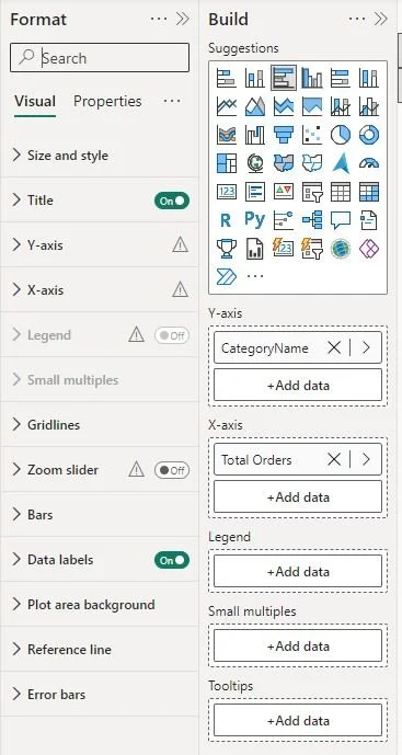
Build Menu: By utilizing Build Menu, you can change the visual type, autosuggest visuals, and add data to customize chart components such as the x-axis, y-axis, legend, and tooltips. This menu is contextual, showing only options relevant to the selected visual. You can build visuals by inserting a specific chart type and adding data or dragging fields from the Data Pane directly onto the canvas.
Format Menu: This feature lets you quickly add and customize common chart elements such as titles, axis labels, data labels, and legends. The menu provides access to additional properties in the Format Pane to enhance visual appeal and readability. Being contextual, it shows only options relevant to the selected visual.
On-Object Formatting: A fantastic tool that allows you to directly format elements of a visual by selecting them on the canvas. You can customize properties such as color, size, and style of chart elements (bars, columns, lines, etc.) by clicking on the visual and making adjustments without navigating to the Format Pane. This tool streamlines the formatting process and provides a more intuitive, efficient way to adjust the appearance of visuals.
Line Chart: This feature allows you to create a visual representation of data over a period of time or other continuous range. A Line Chart connects data points with a line, making trends and patterns easier to observe. It can also be customized with various options like line styles, colors, and markers to enhance readability and visual appeal.
KPI Cards
Allows you to create a visual that displays Key Performance Indicators (KPIs) clearly and concisely. KPI Cards typically show a single metric or data point, a target or goal value, and an indicator that shows how the metric compares to the target. This visual is helpful for quickly assessing performance and progress toward specific objectives. KPI Cards can be customized with different formatting options to match the report's design.
Bar Charts
Can be vertical or horizontal and help compare quantities across various groups. The length of each bar corresponds to the value it represents, making it easy to identify which categories have higher or lower values.
Filtering Options
Offers various filtering options to control which data is displayed in your report, allowing you to focus on specific data points and create more targeted insights.
Visual-level filters apply to specific visuals, allowing you to filter the data displayed in a single visual without affecting others on the same page.
Page-level filters apply to all visuals on the current report page, providing a consistent view of data across different visuals on the page.
Report-level filters apply to all visuals across all pages in the report, ensuring uniform data filtering throughout the entire report.
Doughnut Charts
A circular visual similar to a pie chart but with a hole in the center, Doughnut Charts are useful for displaying the distribution of categories and comparing proportions within a dataset. The chart displays data as proportional segments of the whole, with each segment representing a category's share of the total. The hole in the center provides a central focus and can make the visual easier to read. You should compare no more than four items at a time for optimal clarity.
Table Values: These refer to data presented in a tabular format within a table visual. By organizing data into rows and columns, similar to a spreadsheet, Table Values allow you to view and analyze detailed data. You can include multiple fields in the table, and each column represents a different data field. Table values are useful for examining data at a detailed level and can be customized with different formatting options.
Matrix Values: Similar to a Pivot Table, this visual allows you to present data in rows and columns and provides the ability to add nested rows and columns for hierarchical data analysis. These values help you visualize data at different levels of granularity and give a way to analyze data using other dimensions.
Conditional Formatting: Dynamically format visuals such as tables or matrices based on the values within cells. You can adjust properties like background color, font color, data bars, icons, and even Web URL links. These options are found in the Format Pane under Cell Elements. Conditional Formatting helps highlight key data and trends, making interpreting and analyzing information in your visuals easier.
Top N Filtering: This feature allows you to filter data in Power BI visuals to display the Top N values based on a specific field. For example, you can apply Top 10 Filtering to a visual showing products, so it only displays the Top 10 products based on sales or another metric of your choice. This filtering method helps you focus on your report's most significant or relevant data points, such as the highest-selling products. You can set up Top N Filtering in the Filters Pane and apply it to specific visuals or at the page or report level.
Top N Text Card: Display a single item from a Top N filter based on a chosen metric, rather than a list of items. It focuses on presenting the top value from a text field, providing a concise overview of the most significant category or label according to the metric.
Map Visuals
This feature allows you to visualize geographical data in a Power BI map. You can plot data points based on location fields such as addresses, cities, or regions and use different map types like bubble maps, filled maps, or shape maps. Map Visuals enable you to display data in a spatial context, making identifying trends, patterns, and relationships based on geography easier. You can customize map visuals with different colors, markers, and layers to enhance readability and clearly represent your data.
Slicers
Slicers are interactive filters that give users an intuitive way to control and refine data displayed in a report or visual by selecting specific values from a list. This includes options such as categories, dates, or numeric ranges. They can be displayed as dropdowns, checkboxes, buttons, or sliders and filter data at the visual, page, or report level. Slicers enhance the interactivity of reports, making them more user-friendly and allowing for targeted data analysis.
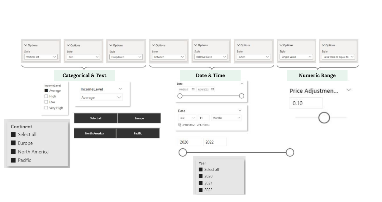
Slicers with Maps
Use Slicers with Maps to select and focus on specific data points, such as geographic regions, time periods, or categories. When used with map visuals, Slicers can help you narrow down the data displayed on the map, making it easier to analyze and interpret spatial data. Combining report Slicers with maps allows you to create more dynamic and user-friendly reports that will enable targeted data exploration.
Slicers with Time
These allow users to filter data based on time-related criteria such as days, months, quarters, or years. Time Slicers can also take various forms, including date pickers, sliders, or list selections. Users can choose specific periods or ranges to control the data displayed in visuals and reports. Doing so lets you focus on particular time frames for detailed analysis and efficiently compare data across different periods. This feature enhances the interactivity of reports and facilitates time-based data exploration.
Gauge Charts
A type of visual used to display the progress of a value toward a target. These charts use a needle to indicate a single value on a circular arc, often divided into segments representing different performance ranges (e.g., low, medium, high). Gauge Charts are commonly used to track key metrics and goals, such as sales targets or performance objectives, and provide a clear, visual representation of how close the current value is to the target.
Area Charts: These visual types represent data using filled areas under a line connecting data points. These charts display trends over time or across categories, showing the magnitude of values as an area under the line. The filled area can be customized with different colors and styles, making it easy to visualize cumulative data and compare different series.
Area Charts help display changes over time or other continuous ranges, particularly when you want to emphasize the volume of data or highlight differences between multiple series. Using stacked Area Charts can also compare various data series and see their cumulative impact on the total value.
Drill Down: This feature enables you to dive into more detailed levels of data. For example, if you are looking at sales data at the year level, you can drill down to see data by month, week, and day. This allows you to explore data more granularly to uncover specific insights.
Drill Up: Conversely, Drill Up helps you move from detailed data levels to higher levels of aggregation. For instance, if you look at sales data daily, you can drill up to see data by week, month, and year. This helps you gain a broader perspective of the data.
Drill Through Filters: These Power BI filters enable users to jump to a specific report page that is already filtered based on the selected data point. For example, if you have a page dedicated to product details, you can set it up as a drill-through target and configure the drill through filter to use the product name.
When a user right-clicks on a product name in a visual such as a matrix, they can choose the Drill Through option, which will take them directly to the detailed report page filtered for that specific product. This streamlined navigation provides a focused view of the data related to the selected item, allowing for more detailed analysis and exploration.
Report Interactions
When a user selects a data point in one visual, it can filter or highlight related data points in other visuals on the same page. This includes cross-highlighting and cross-filtering. Users can customize these interactions using the Edit Interactions feature to control how visuals respond to selections in other visuals. This enhances data exploration and allows for a more dynamic, interactive reporting experience.
Bookmarks
These preserve the current state of a report page, including data and formatting settings, so users can save and manage specific views and return to that view later. They are commonly used for clearing filters, highlighting specific insights, and navigating reports, providing a flexible way to enhance interactivity and storytelling in Power BI reports.
Custom Navigation Buttons
Create interactive buttons that enable navigation between report pages, bookmarks, or external links. These buttons can be designed to match the visual style of the report and provide an intuitive way for users to explore the report. Custom Navigation Buttons enhance the user experience by making it easy to quickly move through the report and access different views or related content.
Slicer Panel
A section of a report page where multiple Slicers (dropdowns, checkboxes, or list selections) are grouped together for easier access, organization, data exploration, and analysis. Slicers are interactive filters that allow users to filter visual data based on selected criteria. A Slicer Panel is often designed to enhance the user experience by providing a clear and organized layout for slicers.
Parameters: Define variables that can be used to adjust or modify data and calculations within a report. Parameters provide a way to make reports more dynamic and interactive by enabling users to change values, such as thresholds, inputs, or ranges, and see the impact on visuals and data models.
Numeric Range Parameters: Allow users to define a range of numeric values, set minimum and maximum values along with an increment step, and adjust the range within a report. This type of parameter can be used to filter data or control calculations dynamically.
Field Parameters: Enable users to switch between different data fields in a report. By defining a set of fields as a parameter, users can select which field to display in a visual, allowing for quick comparisons and data exploration. Field Parameters provide flexibility and versatility in customizing visuals and reports.
These parameter types enhance interactivity and user engagement by providing options to adjust data and visuals in real time, making reports more responsive to user input.
Custom Tool Tips
Instead of showing the default tooltip, you can create a custom tooltip that displays additional insights, data, and visuals from another report page when users hover over a specific visual. By using Custom Tooltips, you can provide more detailed and meaningful information to users, enhancing the user experience and facilitating data exploration.
Mobile Layout
Create a custom view of your report optimized for smartphones and tablets. This layout ensures that reports are displayed correctly and can be easily navigated on smaller screens while still making the most of the available space. You can also add mobile-specific elements like buttons and slicers designed for touch gestures. Designing a Mobile Layout enhances the user experience and makes reports accessible and user-friendly regardless of the device.